-other people portrait-
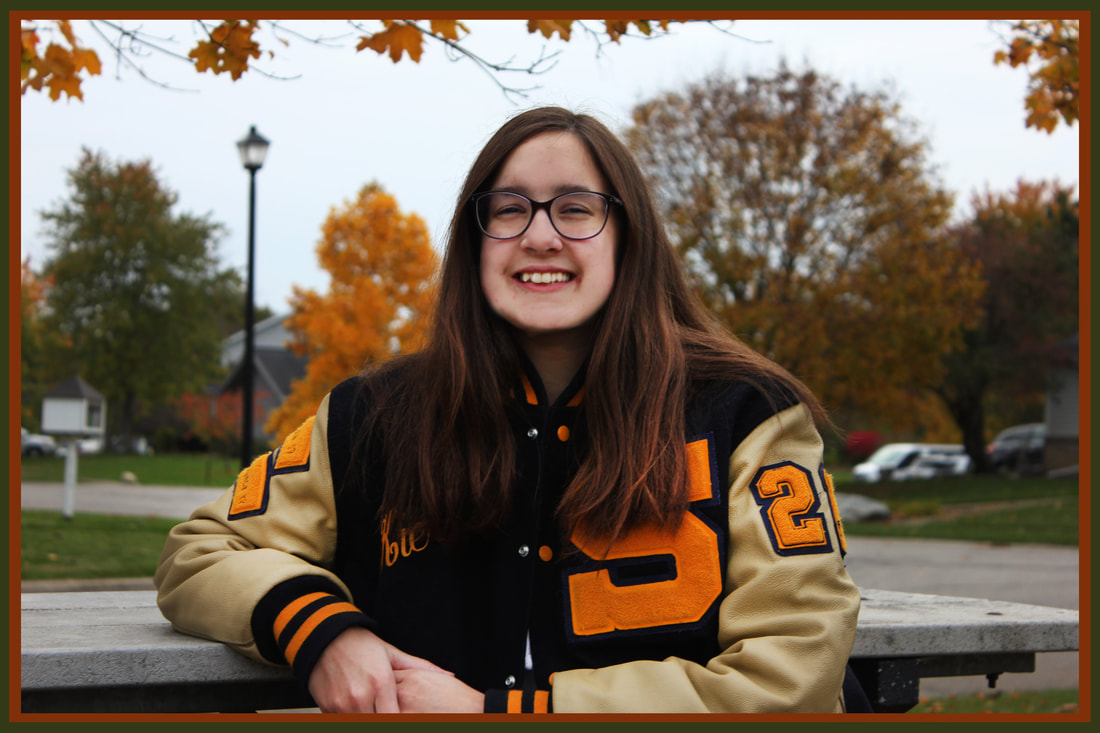
We were assigned to take photos of other people after ourselves. I wanted to take a picture of Kiersten for it. I think the setting was perfect with the fall leaves sorta matching her coat, the photo worked out really well.
It wasn't too terribly hard but once in a while it would get darker so I had to adjust the ISO to keep the shutter reasonable. There wouldn't be much i'd change at all, I'm really happy with how the pictures turned out to look.
It wasn't too terribly hard but once in a while it would get darker so I had to adjust the ISO to keep the shutter reasonable. There wouldn't be much i'd change at all, I'm really happy with how the pictures turned out to look.
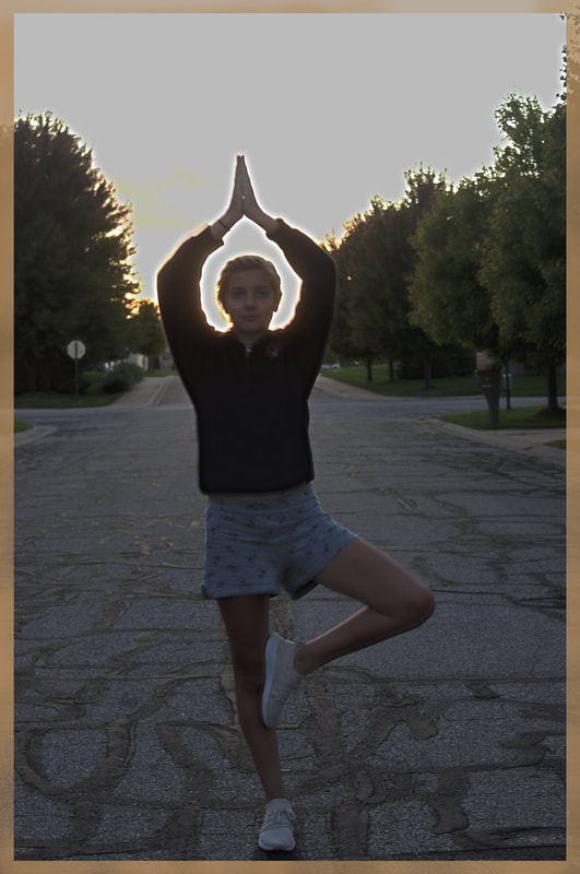
-self portrait-
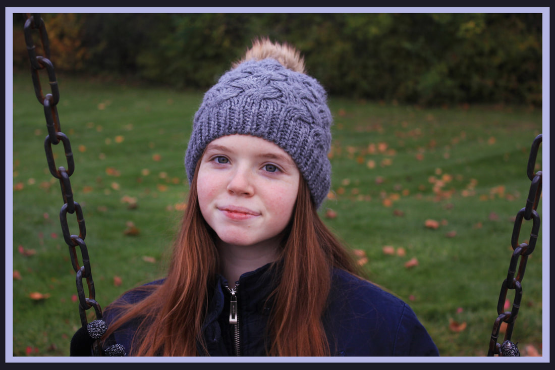
We had to take pictures of ourselves for a self portrait. I picked a park that was close-ish to my house and brought a tripod as well. I set a timer for ten seconds and had to go back and forth to make sure that it all the settings were correct.
This wasn't awful but wasn't easy, it took a really long time for it to look right. If anything, I might have chose a better day for photos so the lighting would have worked out for me better.
This wasn't awful but wasn't easy, it took a really long time for it to look right. If anything, I might have chose a better day for photos so the lighting would have worked out for me better.
-contrast-
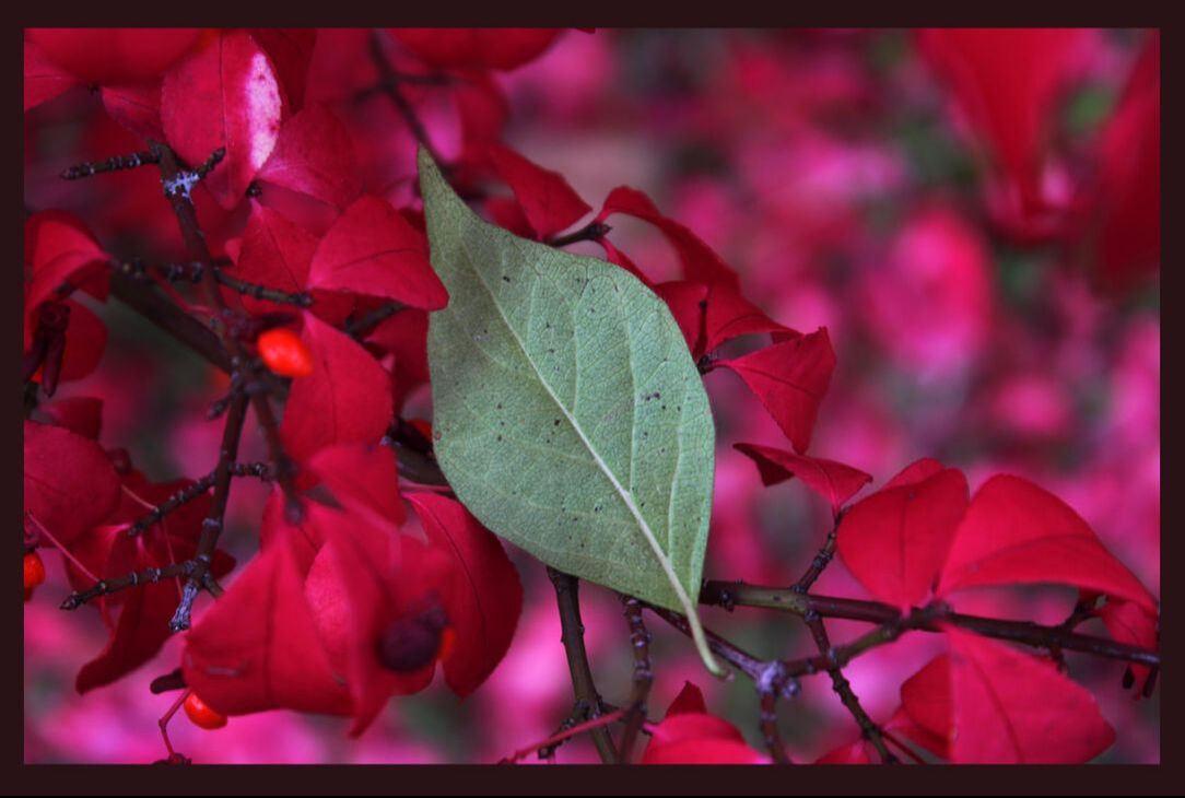
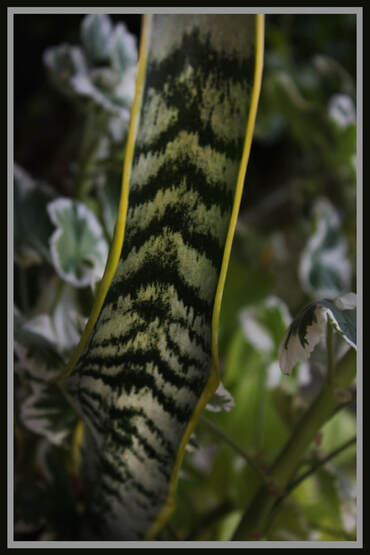
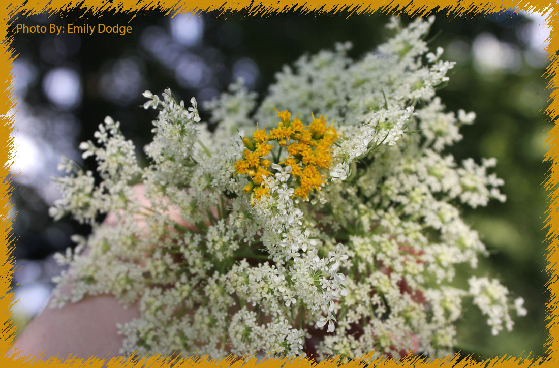
For photo eight, I decided that the green and red leaves would contrast really well together so I picked Contrast as the theme. It was a little tricky to find what would make a decent photo and since it was cloudy out, I didn't have the best lighting. I think they turned out alright for not being able to work with enough sunlight.
-hdr-
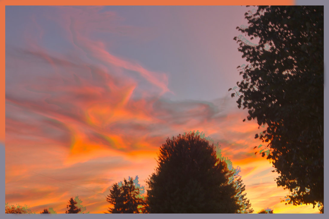
For photo seven, i decided on HDR. We were required at some point and it was a fairy nice night out so I thought that it would be a good idea for HDR. It was a little difficult considering the tripod moved at a a slight touch so I wasn't certain it would line up well. It didn't turn out as bad as I thought, but I think the first round of HDR photos was better.
-collages-
For our collage assignment we had to bring in photos that describe/show who we are. Using photoshop we then had to blend these photos together.
After we created that one, we made another collage of where we see ourselves in five-ten years from now.
After we created that one, we made another collage of where we see ourselves in five-ten years from now.
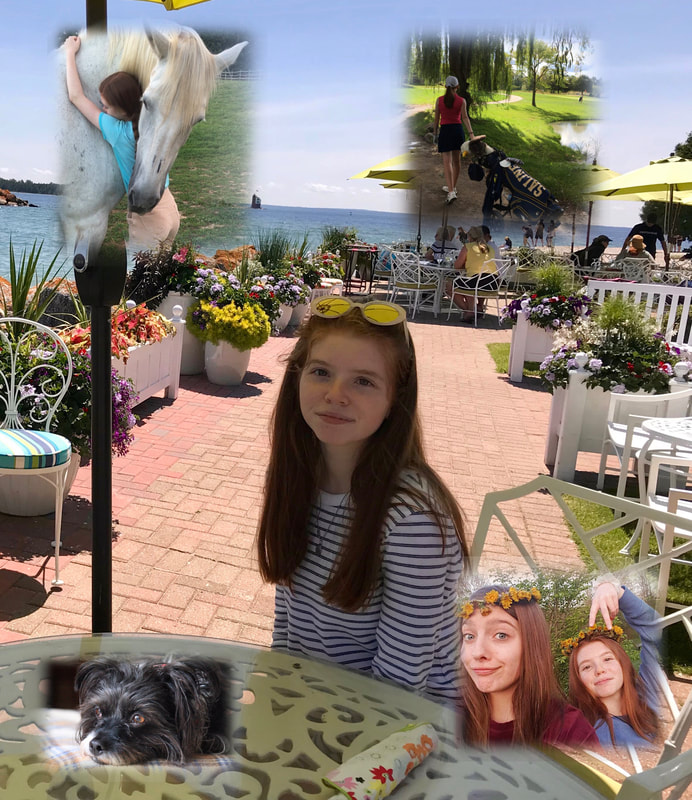
I blended together a base photo from Mackinac Island, my dog Maggie, me and my cousin making dandelion flower crowns, a photo from sophomore golfing season and a photo of me and my favorite horse Winter (the trick I taught her which was to hug).
In photo shop, after we put in the photos in we had to create a layer mask in order to use the gradient tool and make it fade in. It wasn't too hard to do once it was figured out, but in the beginning it was.
In photo shop, after we put in the photos in we had to create a layer mask in order to use the gradient tool and make it fade in. It wasn't too hard to do once it was figured out, but in the beginning it was.
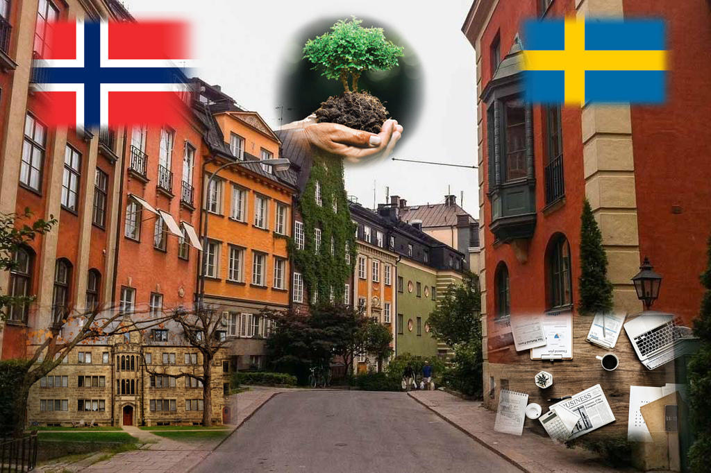
Using the same techniques, we had to find photos off of google that would show where we hoped to be in the future. I chose the norwegian and swedish flags because I hope by then I would have traveled to both places and be completely fluent in both languages. The base of the background are apartments located in Stockholm, Sweden where I would hope to live for a while. The left bottom corner is a photo of Kenyon college where I plan on going and studying journalism & environmental sciences/studies.
-nature-
unedited
|
edited
|
Klikk her for å redigere.
-tutorials-
Tutorials were honestly painfully difficult to get through. The end results looked fairly well, but especially the "human robot" took the longest being three hours. the videos to go along with them were very clear on what to do, but sometimes I had a hard time finding the tools. The polaroid was pretty easy after figuring out what to do. The human robot, was not. Finding the paths, pen stroke, shadows, etc was a very complicated process but I'm proud to have finished it. The last one being the water reflection took about 40min-an hour to complete which I don't really think was worth it. It was a little bit more difficult than the polaroid, but still fairly easy.
Overall, I didn't enjoy this as much as the other assignments but I thought it was pretty cool to see how creative people are coming up with editing ideas.
Overall, I didn't enjoy this as much as the other assignments but I thought it was pretty cool to see how creative people are coming up with editing ideas.
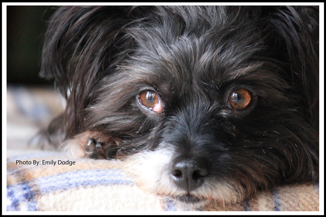
-B&W-
unedited
|
edited
|
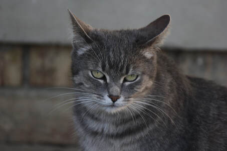
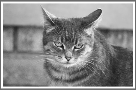
For B&W, I wanted to take a photo of Mila since she's normally stock-still. The lighting out was showing shadows & sunny patches, making the contrast of the photo stand out more (with the help of editing).
Overall, I think I took genuinely nice photos. Turning them into black & white gave it more contrast and definition as well. There's not a lot I would change if I were to redo them, maybe get better angels if anything.
-light painting-
unedited
|
edited
|
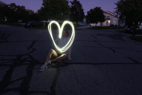
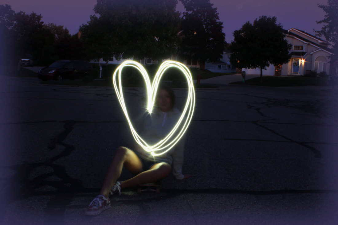
Light Painting was my next category. I remember doing it last year and it was pretty difficult. I had done it indoors and used a lighter as my source of light. It didn't turn out too well because my subjects were also moving so they came out blurred. This time, we went outside when it was close to dark and used an iphone flashlight as the source of light. It turned out much, much better this was in my opinion.
The shutter was set at thirty seconds which gave us an exceptionally long amount of time to create the light lines. One of my subjects, Ali, used her phone flashlight and drew a heart continuously. I think that way looked better than having someone else create the lines.
The shutter was set at thirty seconds which gave us an exceptionally long amount of time to create the light lines. One of my subjects, Ali, used her phone flashlight and drew a heart continuously. I think that way looked better than having someone else create the lines.
-HDR-
In order to get the photos right for HDR, we had to take a total of three photos to merge together. They all had to be taken on a tripod so there would be the least amount of ghosting. All three photos had to be be different within the exposure levels. One had to be two notches over exposed, then normal, then two notches underexposed.
In the end, I think they all turned out really well. I had a lot of fun learning the process and taking the photos in general. I think it was a really neat idea to put the three photos together which would show the highlights, shadows & mid-tones.
In the end, I think they all turned out really well. I had a lot of fun learning the process and taking the photos in general. I think it was a really neat idea to put the three photos together which would show the highlights, shadows & mid-tones.
-architecture-
unedited
|
edited
|
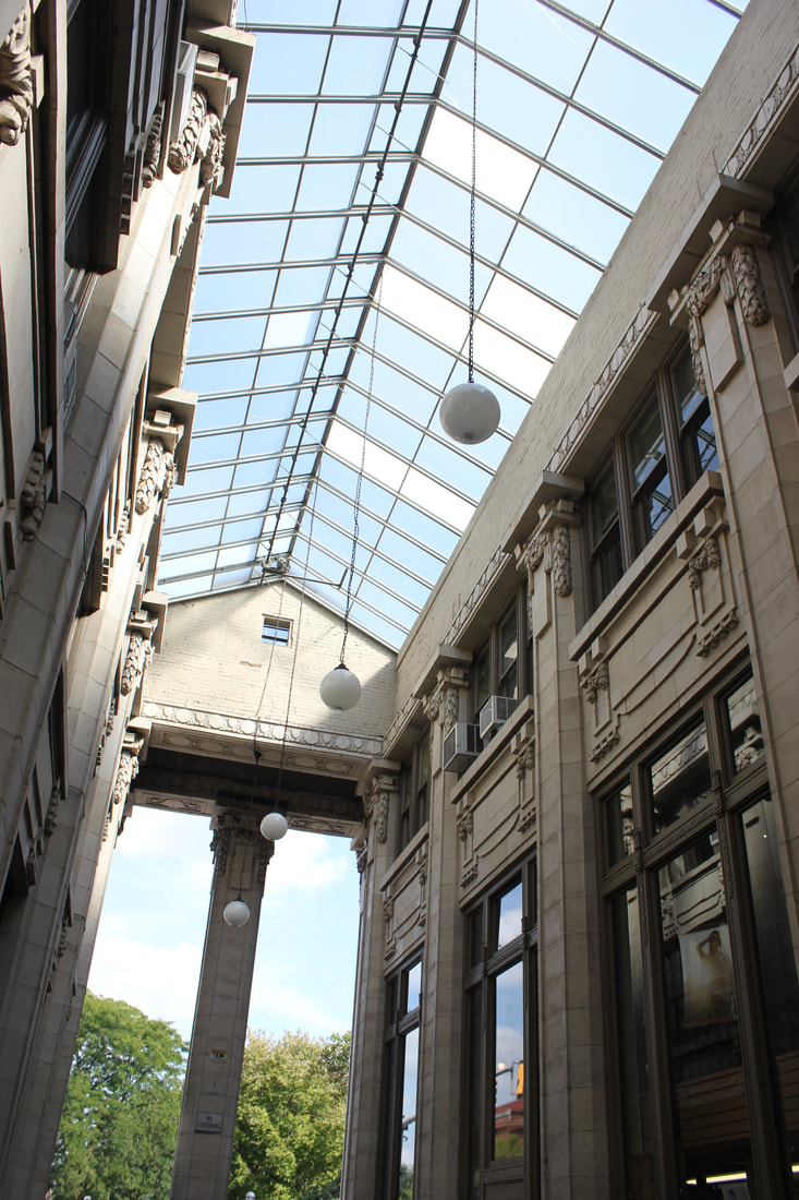
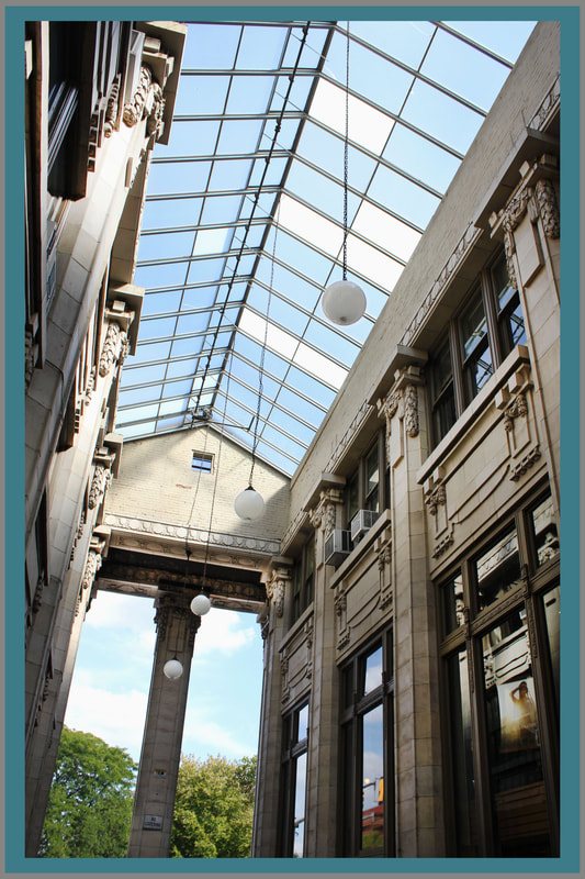
I chose architecture for this weeks photo. I had went to the climate change strike but decided that it would be a good time to take photos for an architecture theme. It was fairly bright outside so there wasn't a lot of exposure changes I needed to do. I think there was a lot more chances I could have taken regarding how creative I was.
In general, the photos I took were decent but not anything I'd say I'm proud of. I would try harder in looking for unique buildings that would make better architect photos.
In general, the photos I took were decent but not anything I'd say I'm proud of. I would try harder in looking for unique buildings that would make better architect photos.
-Typology-
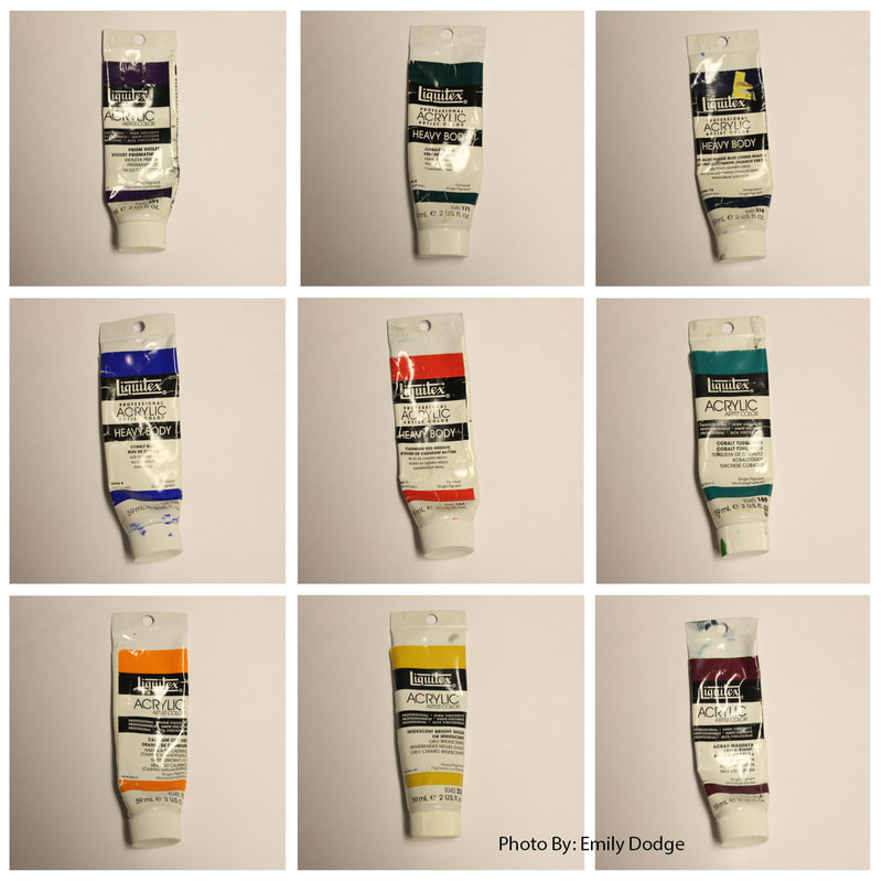
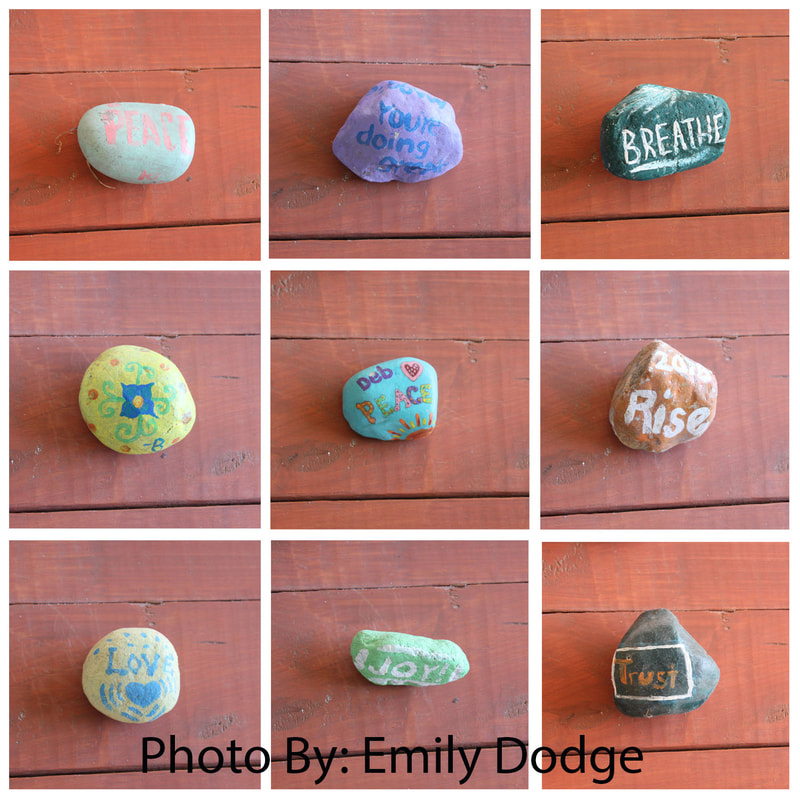
Taking photos for Typology, you had to keep the same background and a same theme for the main subject. I chose these kindness rocks & Acrylic bottles as my focus. I think the acrylics would have turned out better with clear lighting and not as much glare on them. The rocks I think came out quite nice and they were vibrant and has interesting designs. Photoshopping was something that took a while to figure out, but I enjoyed it once I got it.
Overall, it was fun to take and put together in photoshop to see the final outcome.
Overall, it was fun to take and put together in photoshop to see the final outcome.
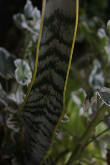
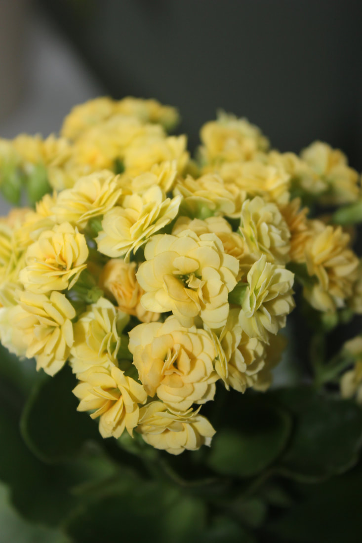
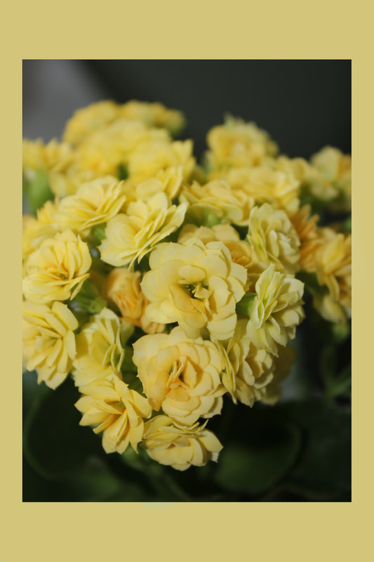
-macro-
|
|
Our second photo I decided to do Macro. I have a small Grapeleaf Begonia plant in my room I decided to shoot with. Then, I also shot my Dumbcane plant as well after I had sprayed it with some water. I decided the Begonia came out better. I didn't edit it much except for a little contrast and some use of the Dodge tool. Some of the photos had flash on them, especially the Dumbcane to really make the water droplets stand out.
I had a really lovely expirence with Macro this time, I really liked the way the water looked on my Dumbcane but also the shadows of the Begonia when the flash went off. Next time though, I'd plan for better lighting since this photo was around the evening when the sun was beginning to go down.
I had a really lovely expirence with Macro this time, I really liked the way the water looked on my Dumbcane but also the shadows of the Begonia when the flash went off. Next time though, I'd plan for better lighting since this photo was around the evening when the sun was beginning to go down.
-panoramic-
Our panoramic assignment was set with the purpose to take about four to five photos of a space. We had to overlap the photos by 40% and merge them on Photoshop. For panoramic photos you have to use a tripod or else the picture won't come out the way it's supposed to. All the four of mine came out as decent as they could, but the fifth is were the merging didn't look as good as I thought. I'm still not quite sure what happened but the sky colors don't match up.
Overall though, this was a nice thing to do from last years experience and see how it turned out this time.
Overall though, this was a nice thing to do from last years experience and see how it turned out this time.
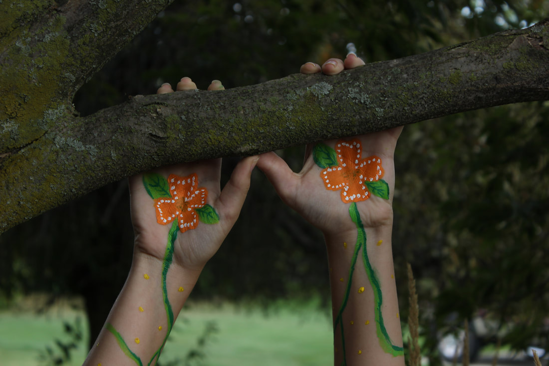
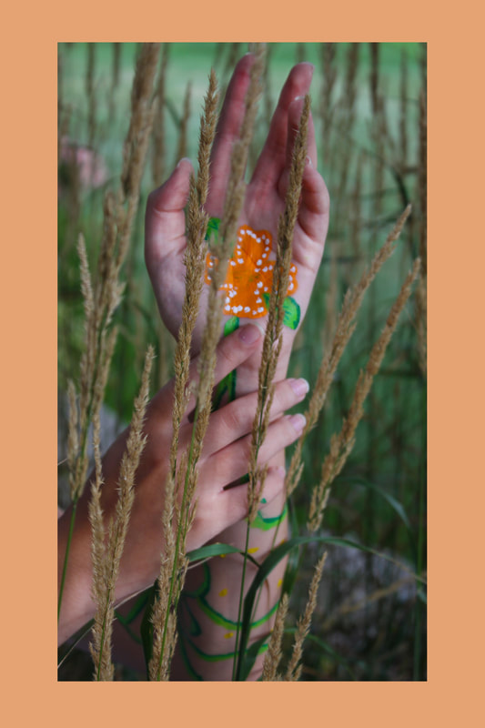
-colour-
unedited photo
|
edited photo
|
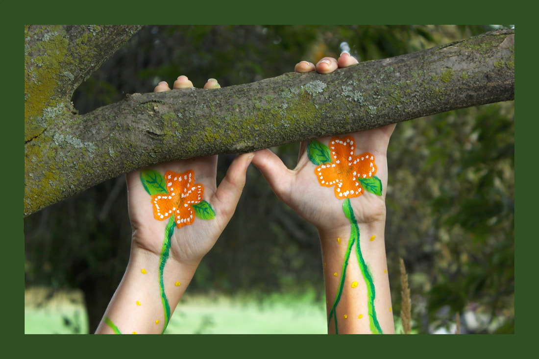
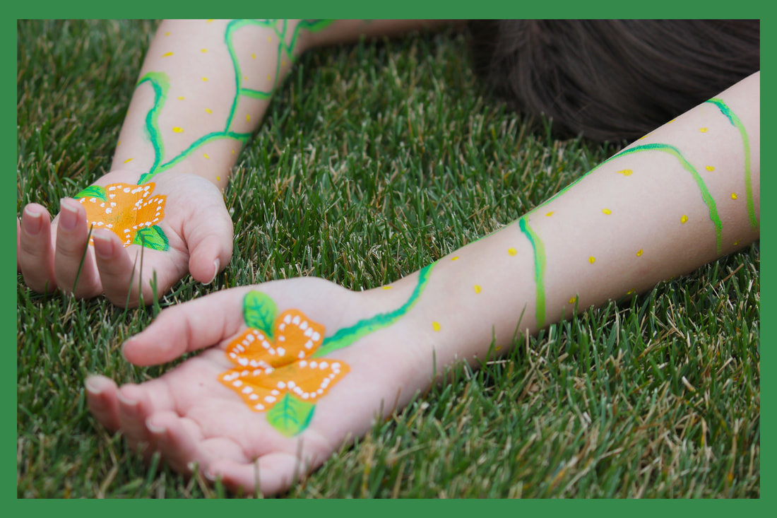
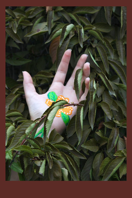
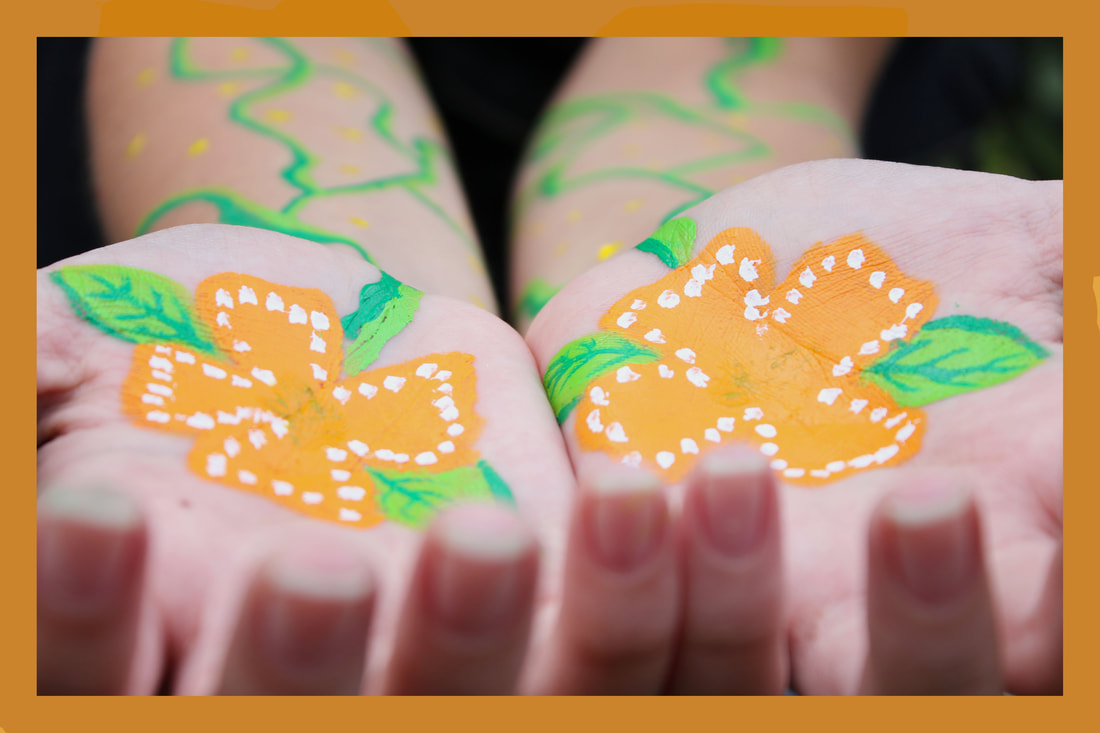
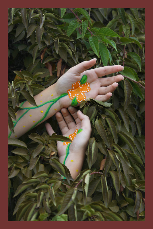
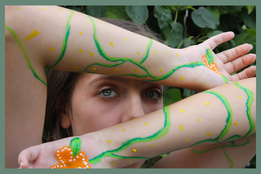
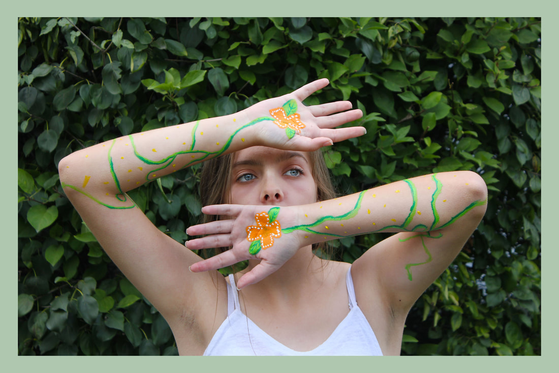
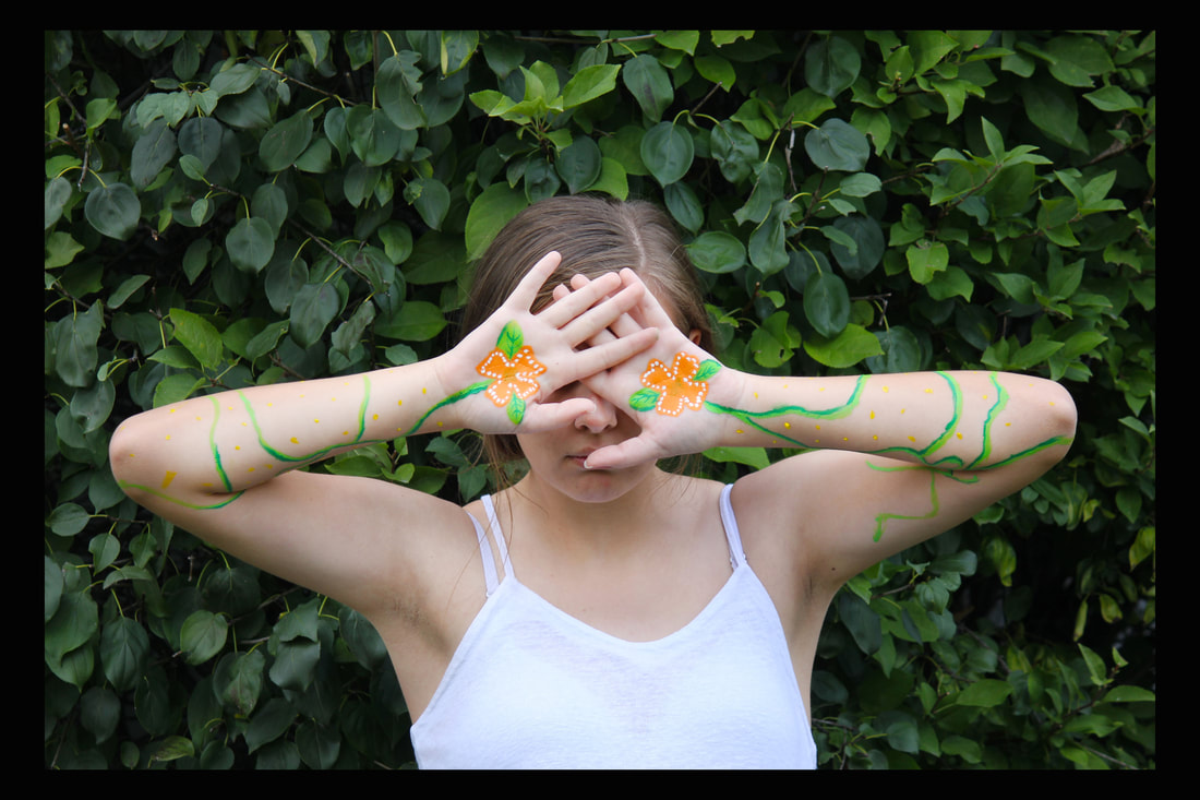
For our first photo, we were tasked with the goal to produce a photo with colors in it. For my photo I decided to paint my cousin's arm with acrylics and make it nature-related. We went outside to several places but this spot seemed to work the best. The hardest part was trying not to have the colors clash though they did a bit. Also, finding the right lighting but in the unedited photo, my brightness was pretty low.
For the next photo assignment, I'll have to make sure all my settings are correct for the location.
For the next photo assignment, I'll have to make sure all my settings are correct for the location.
-Framing-
|
First Row: Gallery
Second Row: Gaussian Third Row: Lasso Fourth Row: Spray Frame |
|
Our assignment was to follow the steps on the DF website to create a frame (two for each). In the beginning, I had a little trouble figuring out the steps to get the right frame but it was fairly simple. Adding color and not keeping a boring right frame really emphasized the final look, it's a nice way to make your photos look more simplistic.
-Principles of design-
-response to pod-
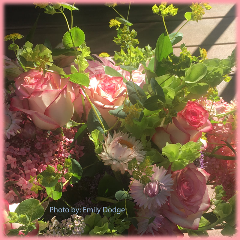
This type of photo composition was a lot more challenging that last years. I enjoyed it more though, I felt there was more freedom with the kind of photos we should take. With this assignment, I noticed my photos become pretty repetitive with the floral theme so I need to work on expanding my options. It was exciting to find new ways that would make my photos turn out more pleasing.
The hard part was coming up with ideas to match the theme it was going with. For proportion, it was difficult to keep my doggie in the same standing position and not blur out the person in the back.
The hard part was coming up with ideas to match the theme it was going with. For proportion, it was difficult to keep my doggie in the same standing position and not blur out the person in the back.
-intro to digital. II-
For my sophomore year I was in digital photography I. I was pretty clueless at the start but later gained a boatload of knowledge. Now, I'm in digital photography II as a junior!!!! I'm excited to see what knew things I'll learn this trimester and to see what I can improve on. My main focus would be to have more creativity in my photos and produce better quality ones.
